I have switched from “regular MP3s” to music streaming in early 2013, when Spotify became available in Poland.
It has changed the way I listen to music.
Update 2025: I don’t use Spotify anymore.
Some changes were qualitative — for example, I started listening to playlists, instead of being a full album purist. Other changes, like the number of artists I listen to, were quantitative. In this post I focus on the latter and use graphs of my Last.fm data to visually verify some hypotheses.
Context
Before I tell you about Spotify, let me describe my music situation.
I listen to music a lot and I am very picky about what I listen to. I have “always” been like this. I don’t think there have been many days since I was 12, during which I was not listening to the music of my liking for at least three hours.
I listen to music when I work, commute, relax, read, run, cook (I only make breakfasts, but still…), do chores, etc. In a first-order approximation: if I’m not listening to music or podcasts, I’m either a) in a social situation in which it’s not appropriate, or b) on a motorcycle.
For the last twelve years or more, I’ve been listening almost exclusively to MP3s, almost always to full albums. Notably, I don’t listen to the radio — I discover new music through friends’ recommendations and various internet things related to the artists I already like.
This is how the landscape looks like, when music streaming enters the scene.
Spotify
During the first day of using Spotify I was confused. Then I realized it’s not some magical service my friends have been talking about, which uses artificial intelligence to know what I want to listen to better than myself. No, Spotify is much simpler at its core — it almost feels like iTunes with a dark UI. There’s just one tiny little detail, though: Spotify has access not only to my local MP3 library, but also to godzillabytes of music on their servers.
This changes everything.
There are many ways to play music in this app. You can start with your own or someone else’s playlist, you can use search, you can start a “radio” based on a particular song, album, artist, or playlist, you can see what your Facebook friends are listening to right now, and so on. The way I discover new music is using the “Related Artists” section on artists’ pages and through the “Browse > Discover” tab, which has impressively good suggestions. This is the way I found two bands from my Top 5 Metal Albums of 2014 list: Monuments and Abolish The Echelon.
After I stumble upon a new artist that I want to listen to, I usually enqueue three of their most popular songs or three first tracks of their most popular album. If I like them, I add a full album to the queue.
The queue works in such a way that it overrules the order of tracks that are going to be played. Regardless of what album, playlist, etc. you are listening to, if you have something in the queue, the next track played will be from the top of the queue. You can think of it as of an improvised playlist. I love this feature and use it heavily.
When I hear a song that I would like to listen to again in the future, I add it to my “Starred” playlist. After two years I have about 2000 songs in there. I mainly use it to find “that great song from a week ago”. Sporadically I play all my stars on shuffle (I almost never shuffle anything) to get an endless stream of great music. The only problem with this approach is that the genre changes can be quite abrupt: from progressive rock slash alternative pop to grindcore to piano ambient to gypsy punk to industrial glitch to brit rock to…
Anyway, back to the story.
For the first few weeks of using the service, I felt like I was listening to way more music. More importantly, almost every song felt new to me — both “I don’t have this MP3” new and “I haven’t heard this before” new.
Play count
This “I listen more” feeling was the first thing I wanted to verify against data. To do so, I created a play count graph and colored old and new tracks differently. Let’s take a look:
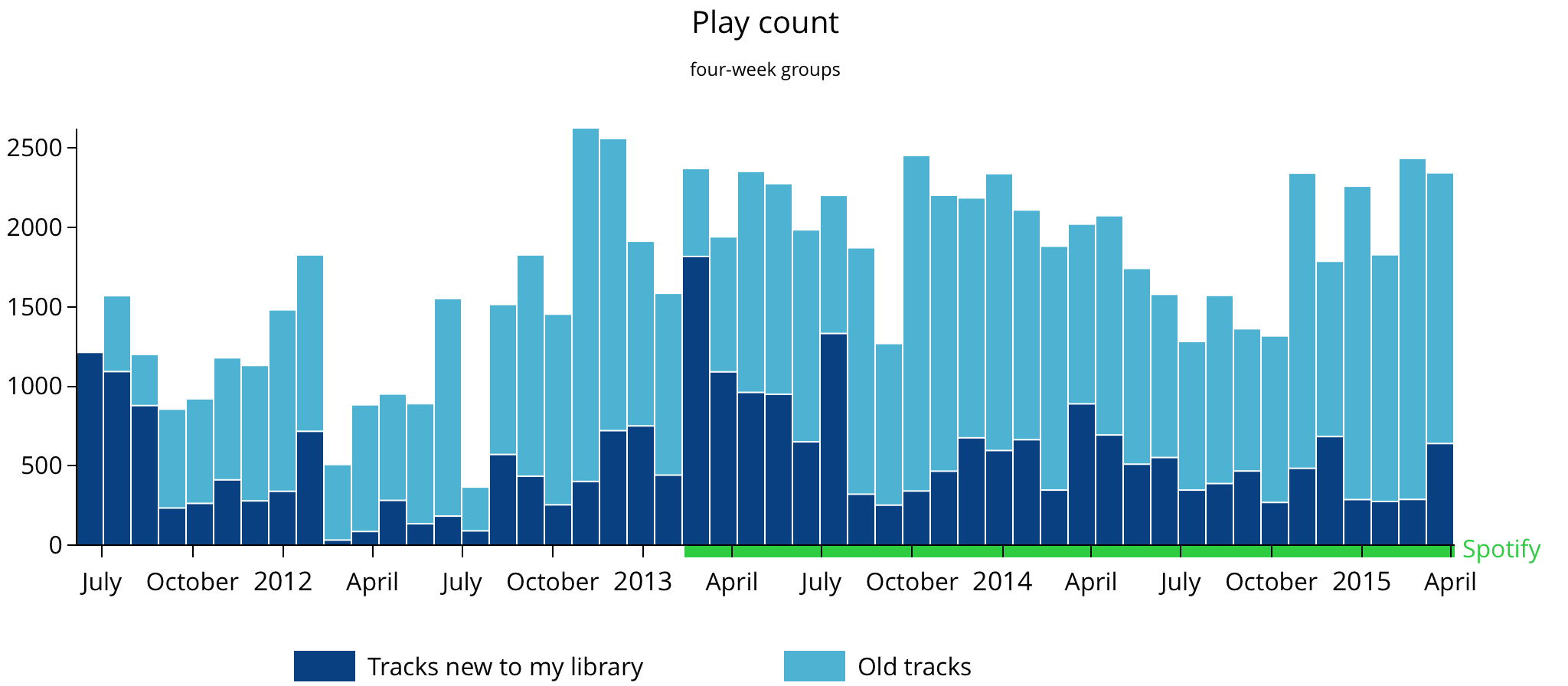
As you can see, I was wrong about the first part — total play count (dark bars + light bars) didn’t change when I started using music streaming. I mean, yeah, bars on the right are generally higher than on the left, but take a look at the period around the switch, even the whole year from August 2012 to August 2013 (vacation months). If old and new tracks had the same color and there was no green bar at the bottom, you wouldn’t be able to tell when the Spotify period began.
On the other hand, the second part of the hypothesis (that I listen to new music) was spot on! The first month of using Spotify was the first month where the majority of music I played was new (excluding the first three months near the left edge of the graph, where there was so little data in the library that almost every song was new). Months following the Spotify switch also have high percentages of new tracks.
Encouraged by the initial results and curious if the strong “Spotify effect” I felt could be more visible (or rather: puzzled that it’s not as visible), I decided to look at the data from different angles and investigate the number of unique tracks and the number of artists I listened to.
Tracks
Looking at the tracks graph, the pre-streaming/streaming divide is much clearer:
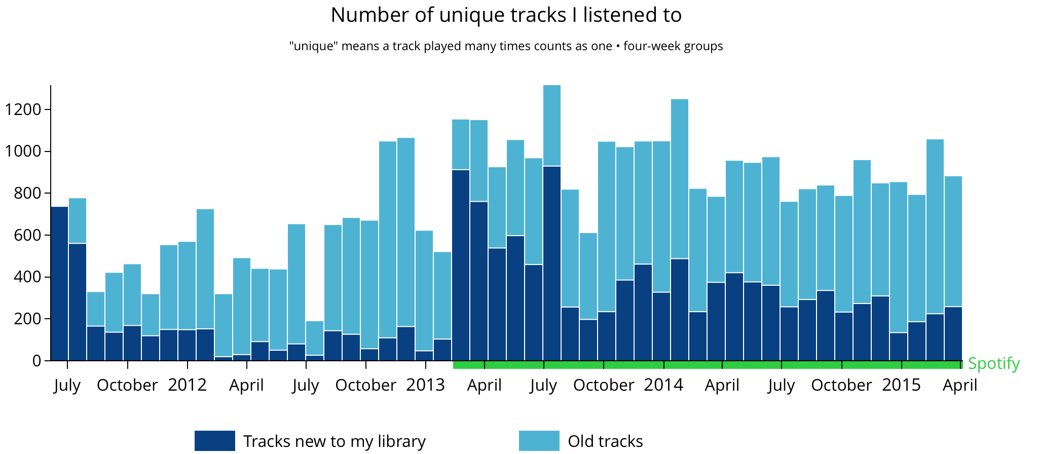
Not only the average number of tracks is higher in the Spotify section, but the number of new tracks is just impressive. This is that “OMG everything is new!” feeling right there in the picture.
To not get completely carried away, I have to share an observation about the nature of the data visible above.
Despite the fact that I find a lot of genuinely good songs now, I think that the shape of the graph is amplified by the fact that in the MP3 days I had to put more effort into getting music into my library. Therefore, I filtered it more, e.g. I checked it out on YouTube first, which isn’t connected to my Last.fm library. Once something got in, I would listen to it at least a couple of times.
Today, when I stumble upon a song I don’t like too much, I listen to it once (or just skip it) and move along. But once I do this, these one-time-songs are remembered in my Last.fm library and visible on the graph.
Either way, Spotify scores a lot of points here, because it combines “regular listening” and music discovery in one app and makes the latter effortless.
Artists
Finally, let’s take a look at the artists graph. Intuitively I was expecting its shape to be similar to the tracks figure above. Turns out, Spotify’s just crushing regular MP3s:
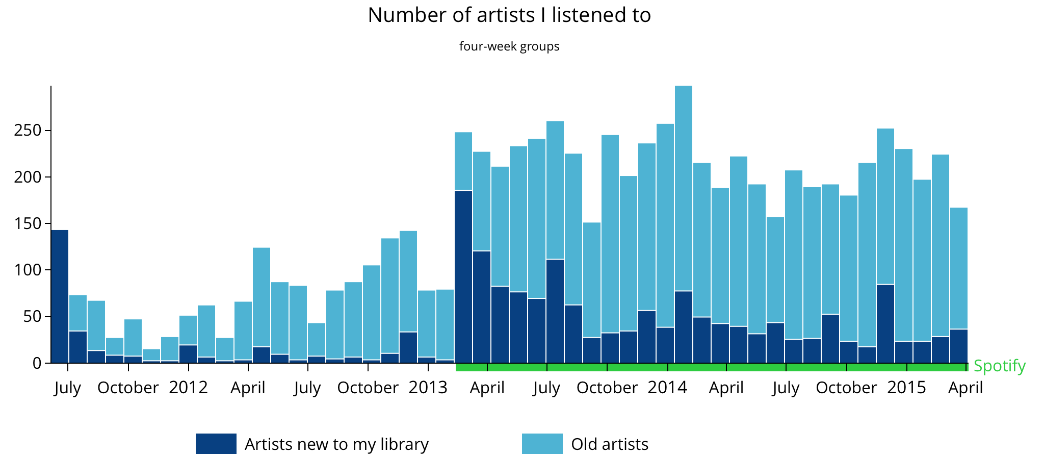
The lowest bar (new + old) from the music streaming period is higher than any bar from the iTunes era. Compared to the right side, the “new artists” bars on the left are so low they seem non-existent.
These results look dramatic and fit nicely with my “more diverse music” theory.
Also, they suggest that the perceived diversity is correlated more with the number of artists than with the number of tracks. Which makes sense, because in general there’s more diversity between artists than between songs of a given artist.
I posted an imgur mirror of this graph (with a slightly longer title) to the Data Is Beautiful subreddit. Feel free to join the discussion there. Also, if you’d like to share an image from this post on social media, this is the one. :)
Update • 2015-04-26
Wow, I didn’t expect this article to do this well! The reception was really good, with many comments, a couple of tweets, and even a few emails from people at Spotify. Thanks to everyone for the kind words, it was a very nice feeling! :)
The Reddit post hit the front page (sic!) and ended up with a score of 3400 and a mind-boggling number of 850,000 imgur image views that used 49 GB of transfer. Google Analytics numbers are more modest (link to the article was in the image and in my top-level comment) but still the best for any of my posts: 2200 pageviews.
I followed Tips for making a successful Original Content [OC] post, paying special attention to the submission graph. I posted at 14 UTC on Tuesday.
There were 345 comments under the post. Redditors mostly agreed that Spotify is a good service for the listeners but expressed concerns about the amount of money that goes to the artists.
I especially liked one comment made by /u/Jahkral, who suggested adding a third color for tracks/artists discovered in the last few months. This is a very good idea, a one that would help to show if I keep listening to the music I find. I’ll use this approach if I revisit the subject in the future.
A few people thanked for the “Technical outline” section. I think it’s good to share information about the process, as well as code and raw data, even if it’s not perfect or well-documented. Some pointed out that I left an API key in my script, which I am thankful for (I revoked the key, there’s no need to message me about removing it from the repo history). There was even one pull request, created by Elliot Bentley, adding documentation for my scripts. Thanks!
Conclusion
Thanks to the switch to music streaming and Spotify features like “Related Artists” and “Discover”, I listen to more artists than ever before and find hundreds of new tracks every month.
My music life is more diverse and I feel that my overall quality of life is higher because of that.
Everything is awesome!
Thumbs up for Spotify.
Technical outline
I used Last.fm API to retrieve data that I’ve been scrobbling for years via iTunes and Spotify. With a Python script, I downloaded weekly track charts and saved them in JSON files. With another (quite ugly) Python script, I grouped, analyzed, and saved this data in CSV files. (I started writing this post over a year before publishing it. Today, I would have used Swift to process data — the same language I’m writing a game in #shamelessplug.)
I visualized CSV data with D3.js and CoffeeScript. It was the first
time I used D3 and I am very happy with the results. I based my work on
Mike Bostock’s tutorial. The tutorial is not perfect for
complete beginners, but is sufficient for people with web
programming
The most important thing I learned about D3 is the fact that it’s not a library for creating charts, but rather a framework for writing visualisation programs.
As always, data and code are on GitHub.
You can discuss this post on Reddit or message me on Twitter.
Thanks to Wioleta Grabowska, Filip Konieczny, and Jarek Pendowski for reading drafts of this.