When working on Glitchy Checkers, my futuristic checkers game for iOS, I became interested in pixel sorting — a moderately popular technique of transforming images to create glitches. To get a feel for pixel sorting, check out a teaser of Ghost in the Shell or take a look at search results:
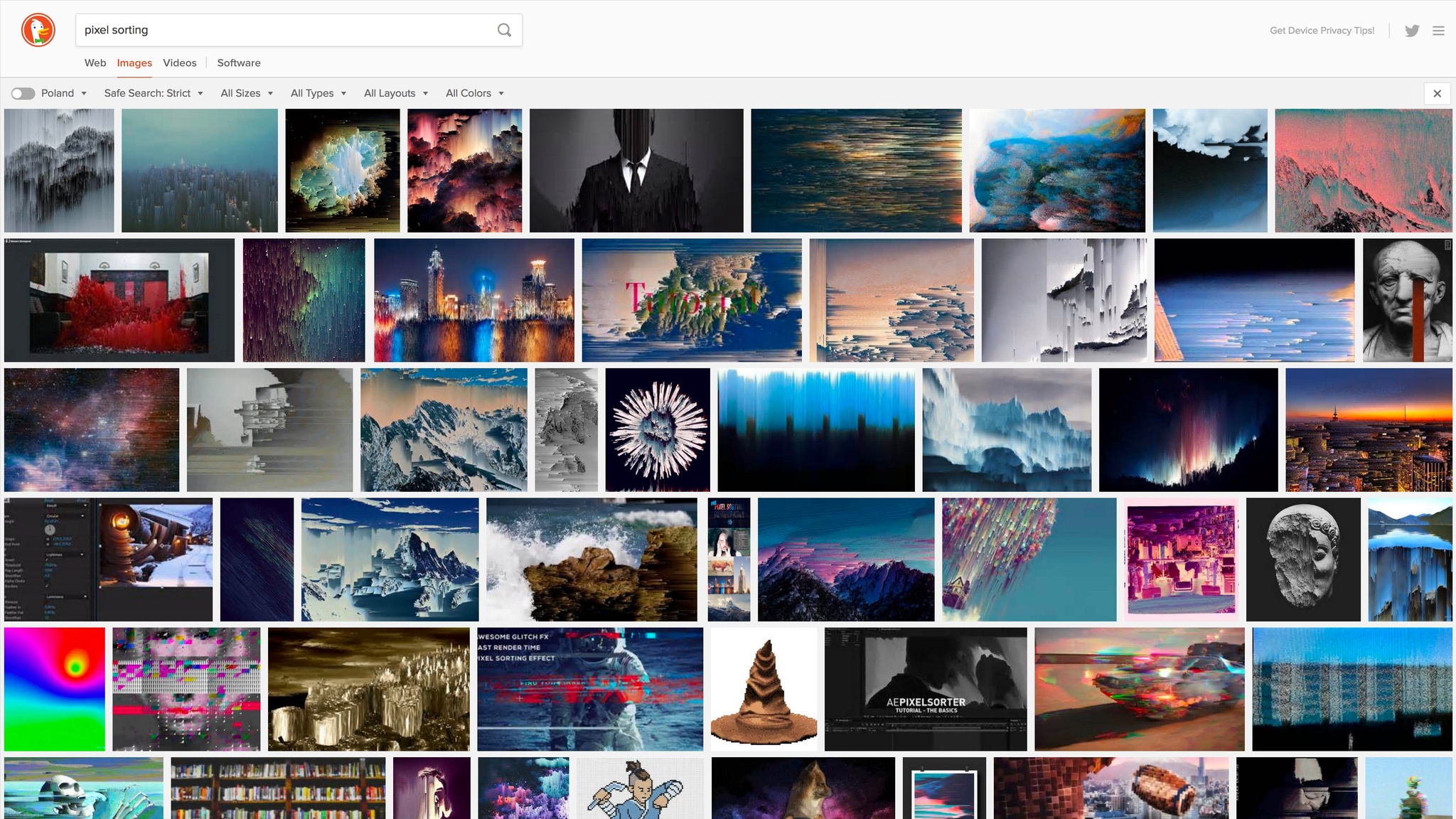
Most often people sort pixels in columns or rows. “Sorting” in this case means reordering colors based on their attributes, e.g. brightness, saturation, how red they are, etc. Reordering pixels in a column is an interesting problem in itself because colors are effectively three-dimensional (they have red, blue, and green components) and thus it’s not clear how to order them in a line.
What makes pixel sorting a popular choice for making glitches is, in my opinion, the fact the effect can be used on a portion of an image and blend well with the original. This leads to images that are glitchy yet recognizable. For example, to preserve some object or a silhouette, one can sort only pixels that fall into a specific brightness range. Areas treated with the effect use the same set of colors as the original, so they usually fit well with untouched areas.
I wanted to explore this technique and see whether it would be a good fit for my game. I also wanted to push beyond what I’ve seen on the internet: I wanted to sort pixels not only in columns and rows but also in circles, spirals, triangles, squares, etc. I thought it might resonate well with geometric shapes of the game.
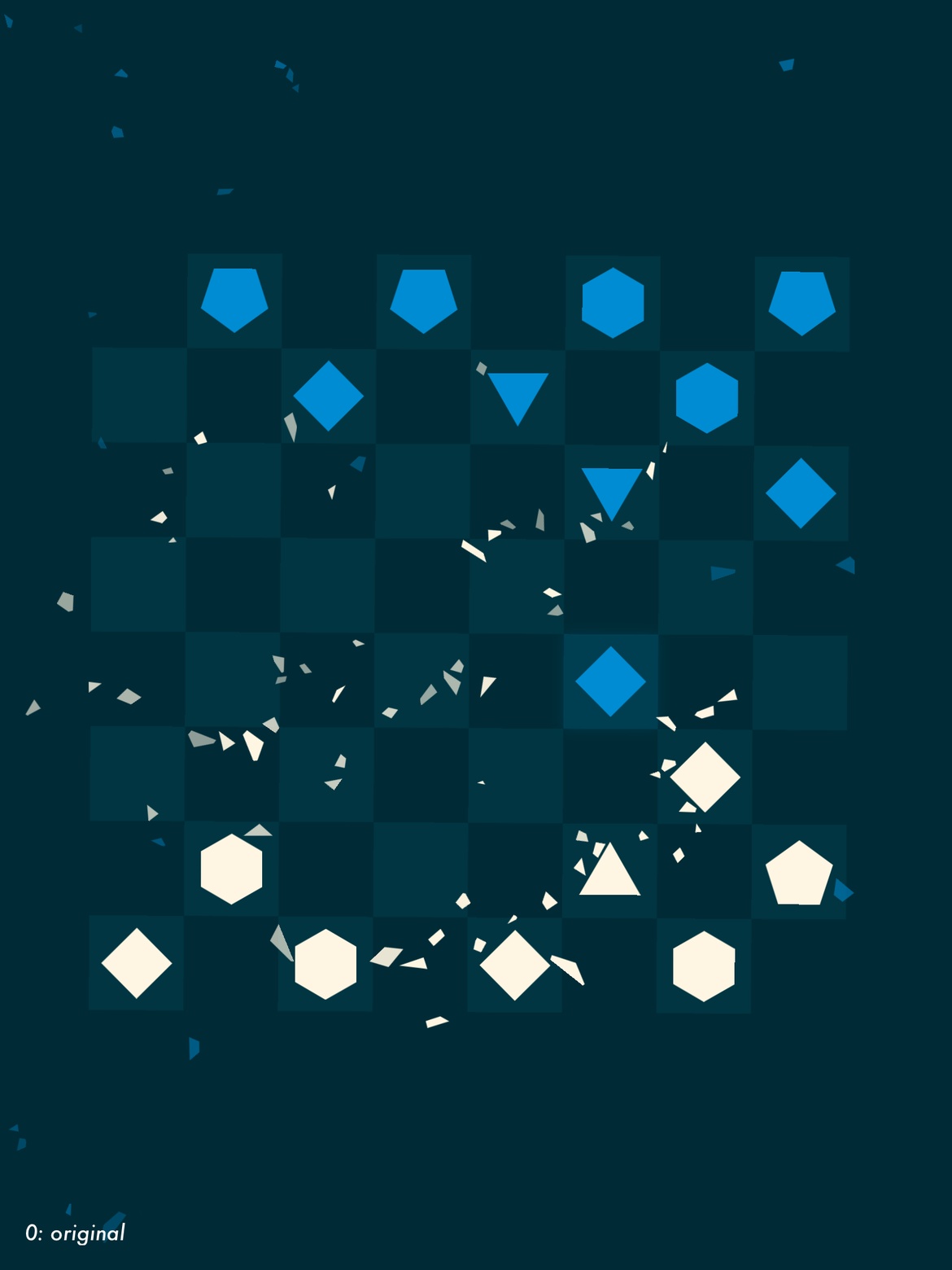
To compare different settings, I decided to use a single source image for all experiments. Every image you are about to see is a transformation of this screenshot from Glitchy Checkers:
I have quickly realised that in order to achieve pleasing results when sorting colors, one has to have more than a few of them to sort. Four-color palette was not enough, so I often blurred the screenshot before sorting. I also experimented with blending multiple results, applying different sorts in sequence, and reordering entire groups of pixels (e.g. 128x32 areas). Here are my results:
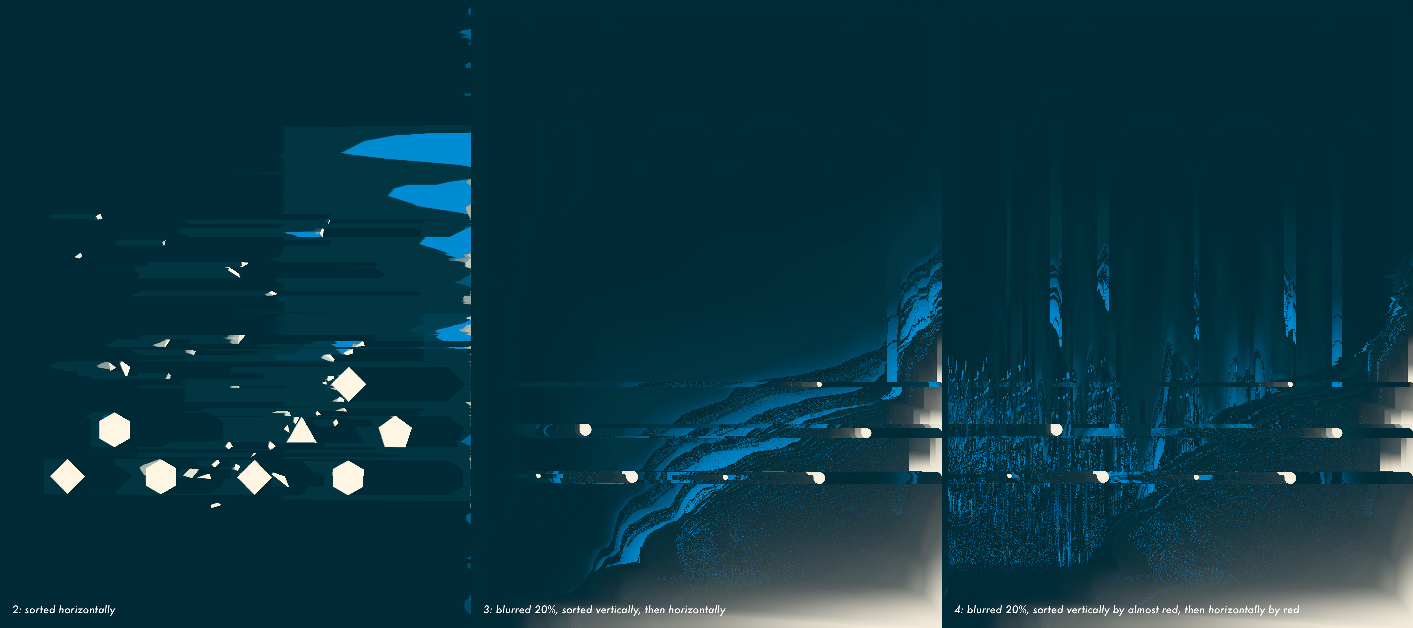
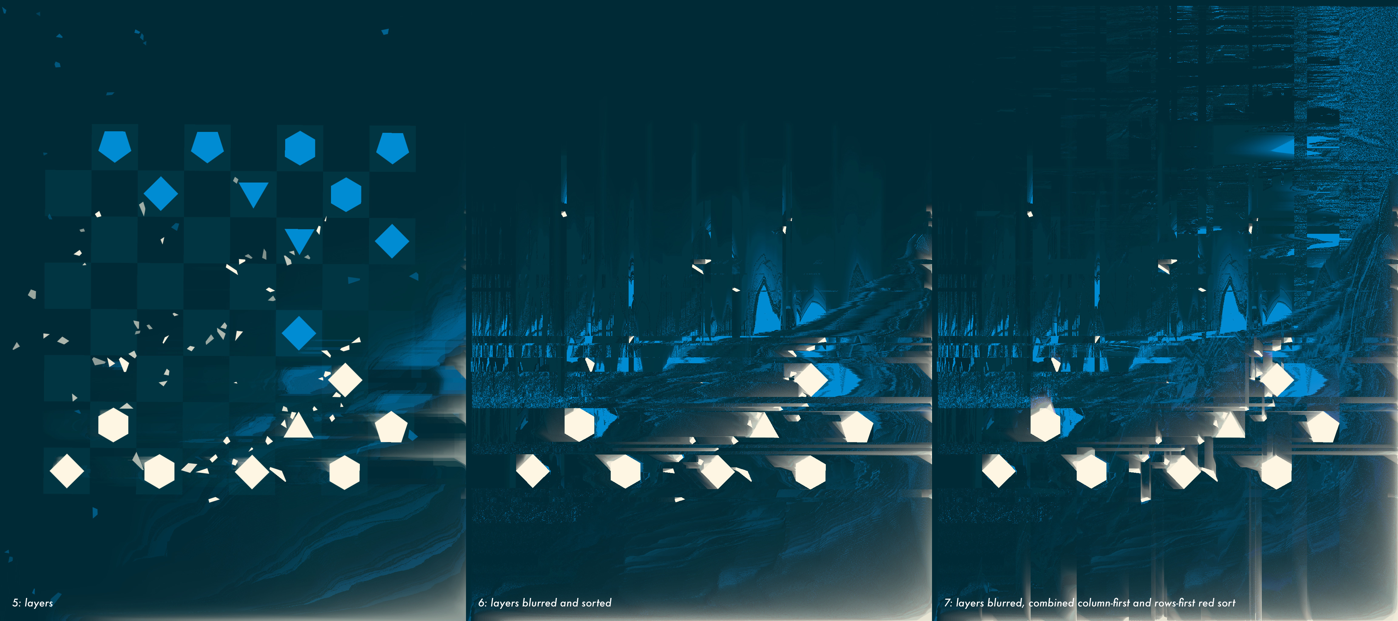
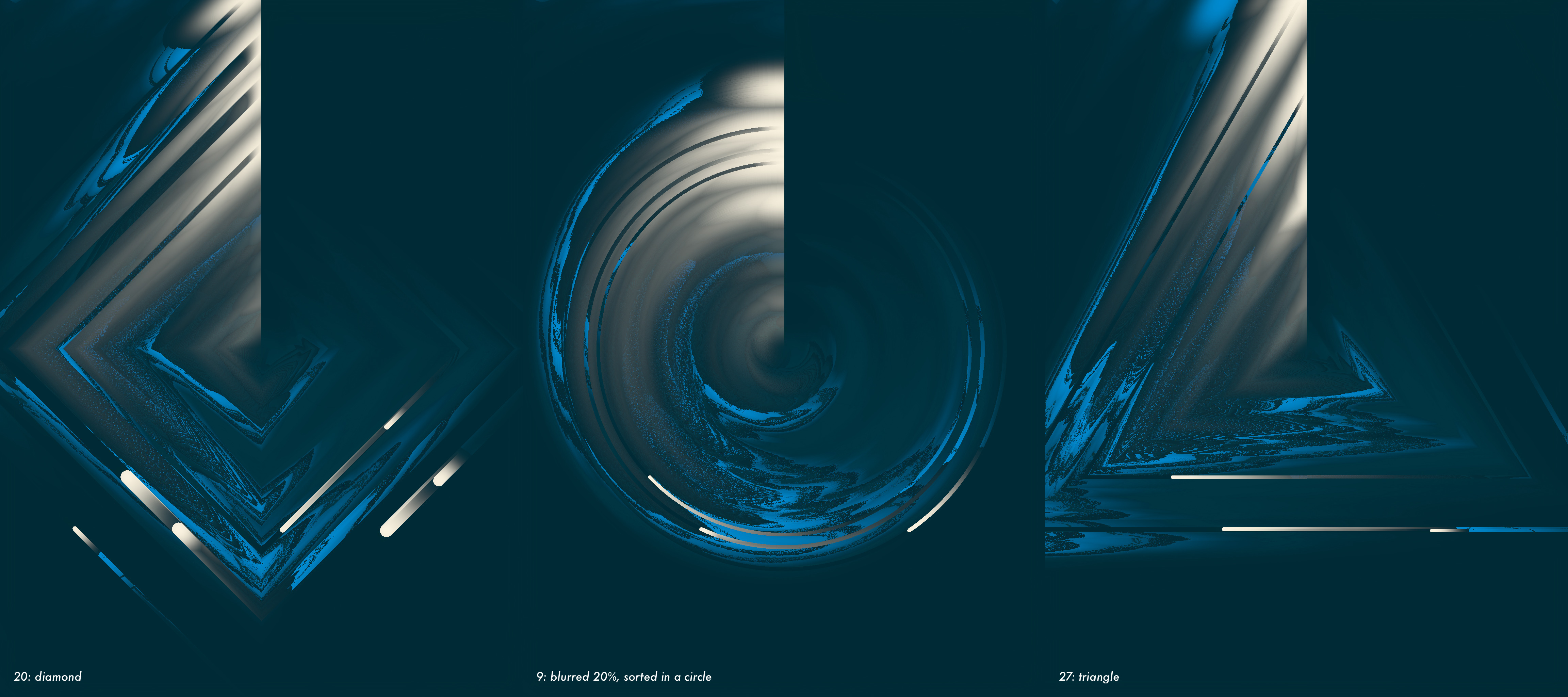
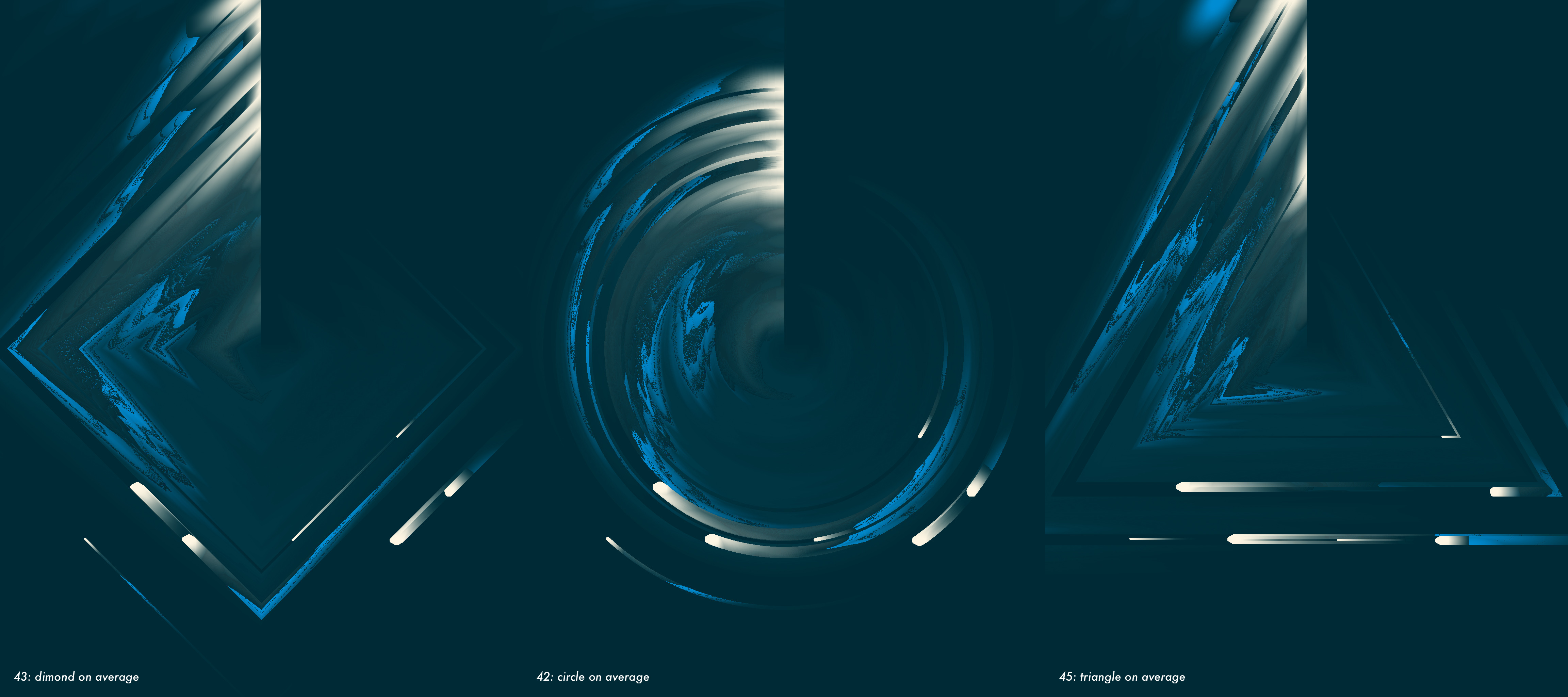
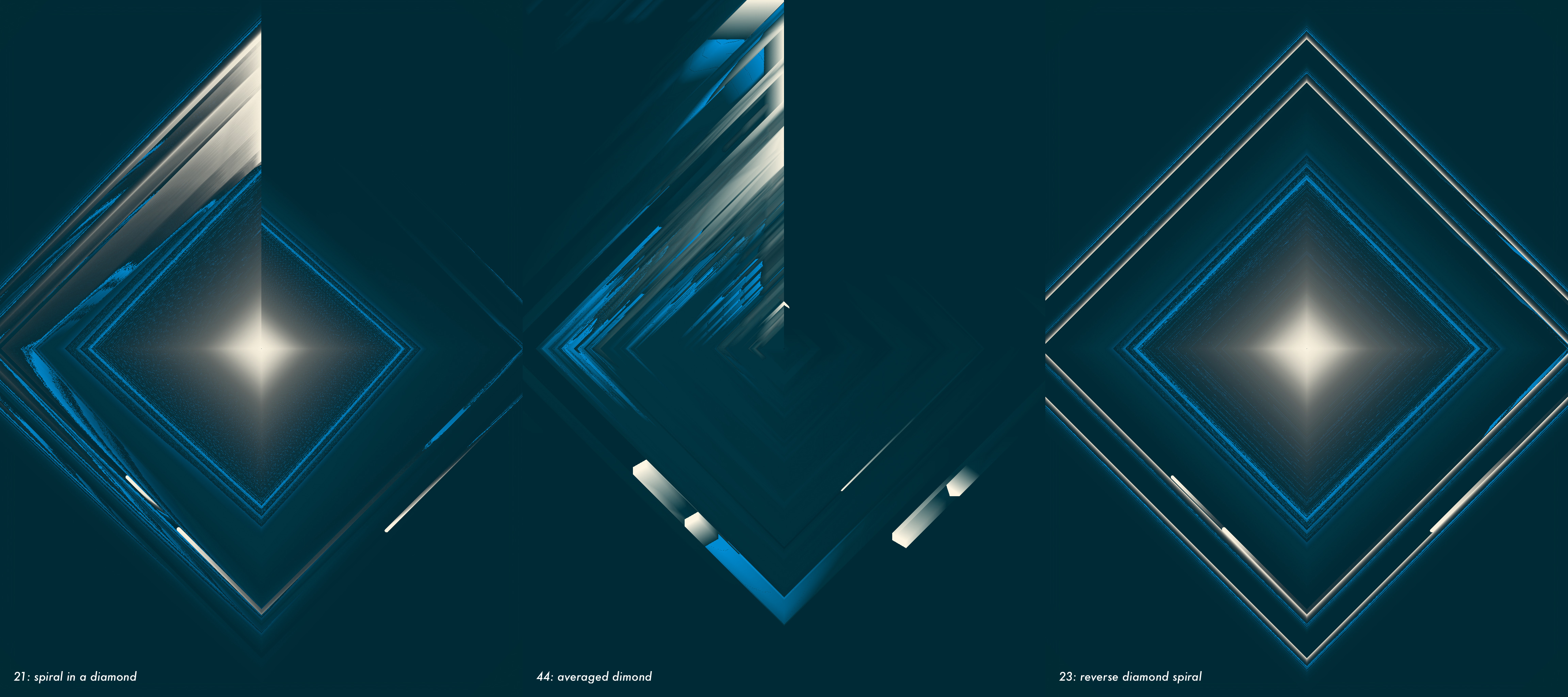
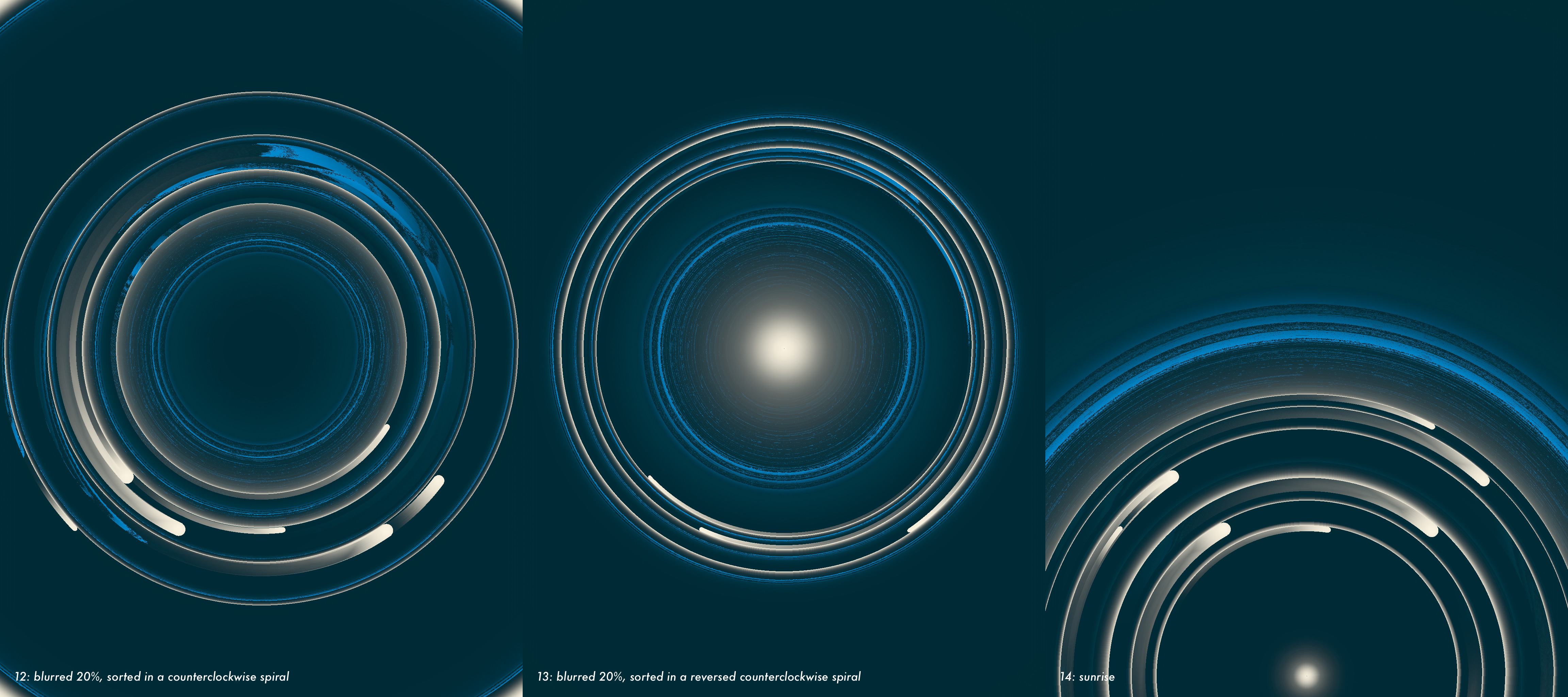
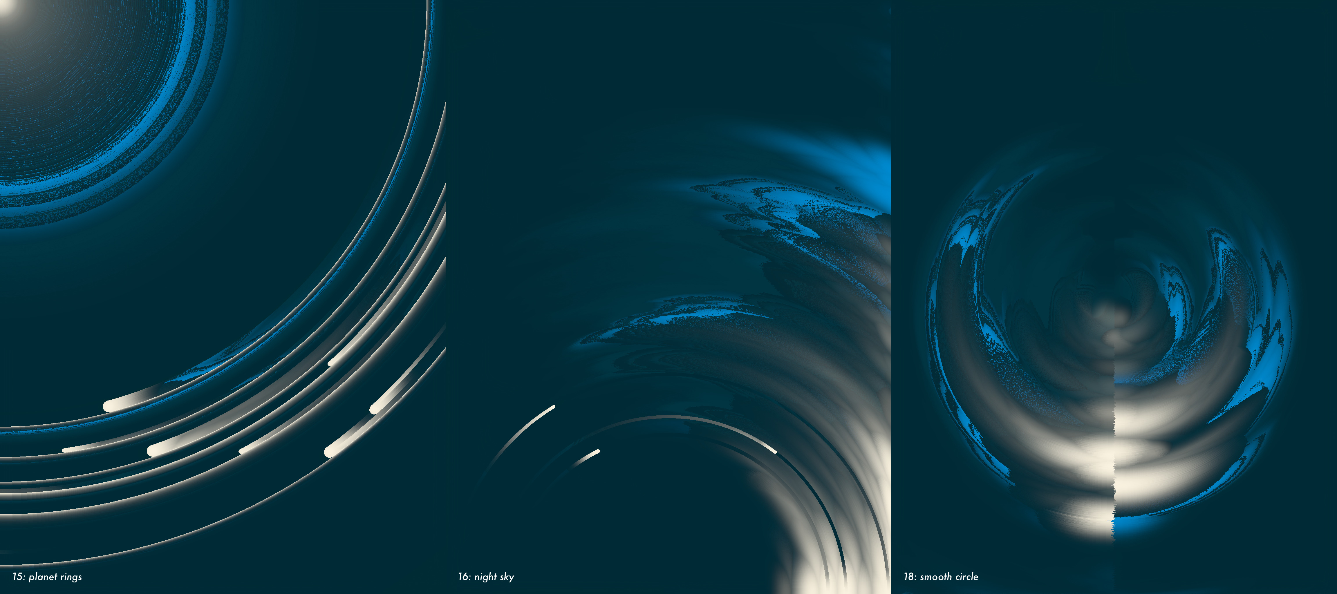
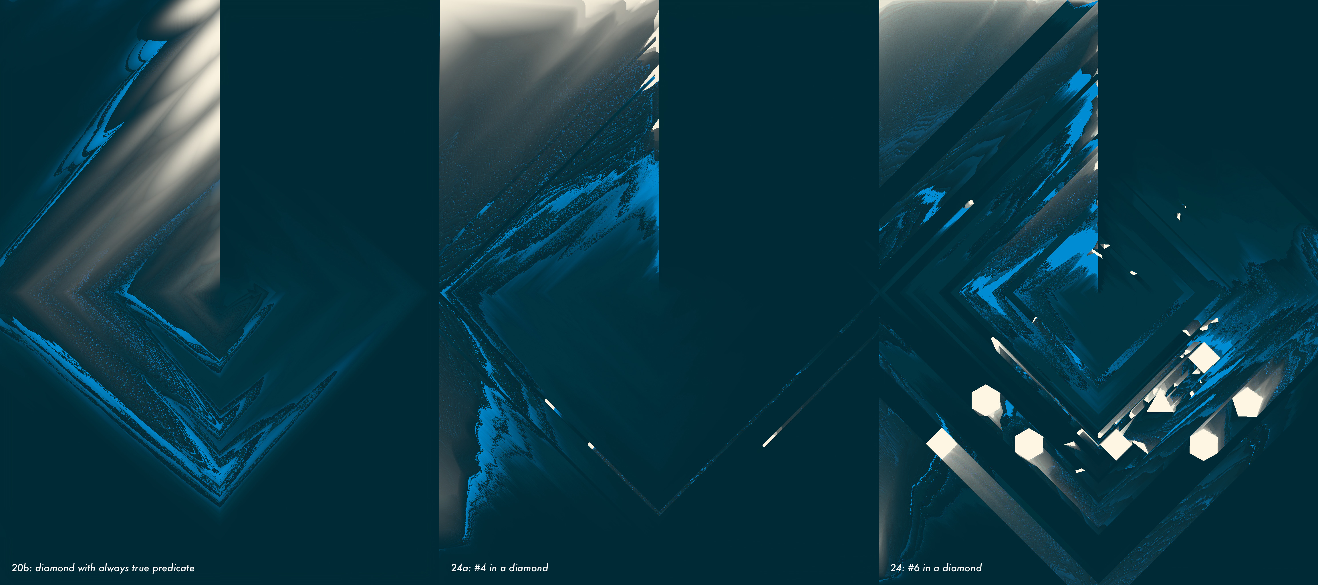
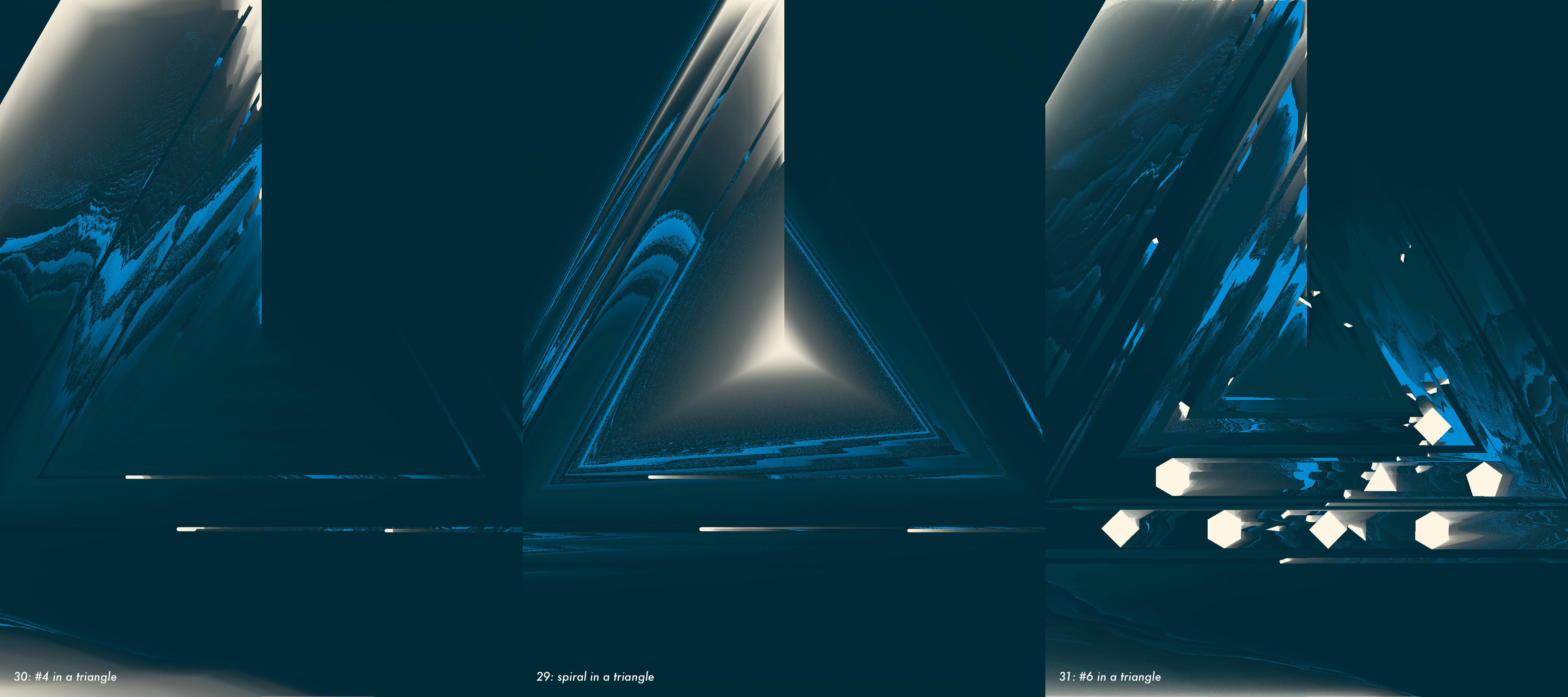
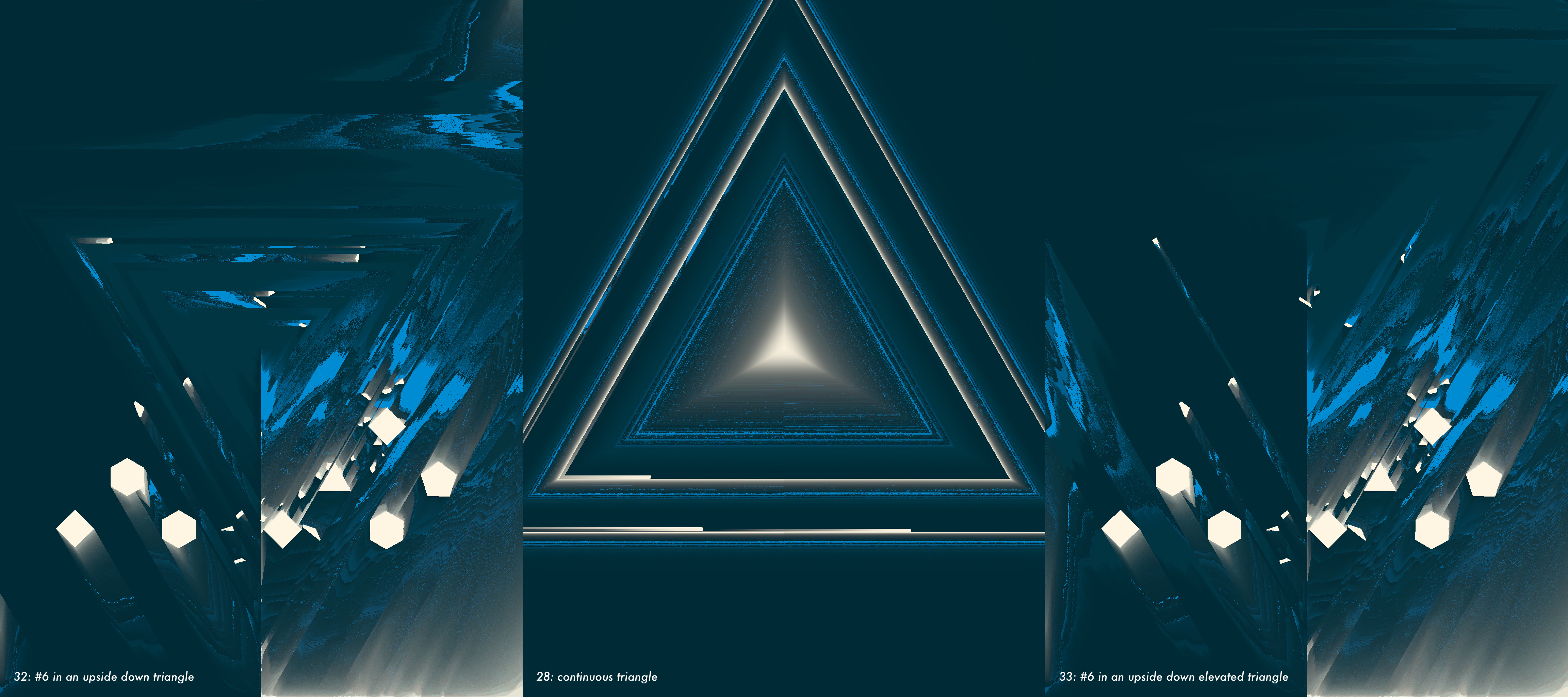
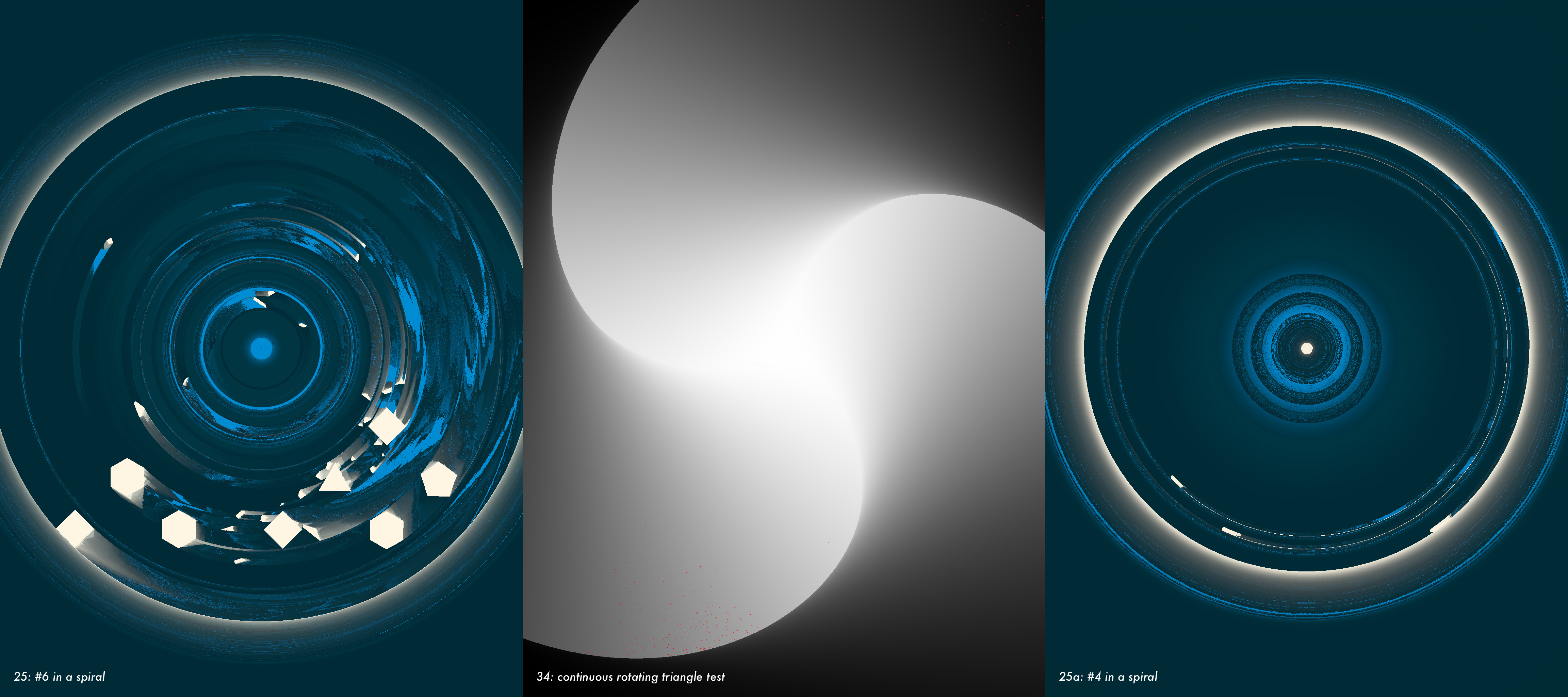
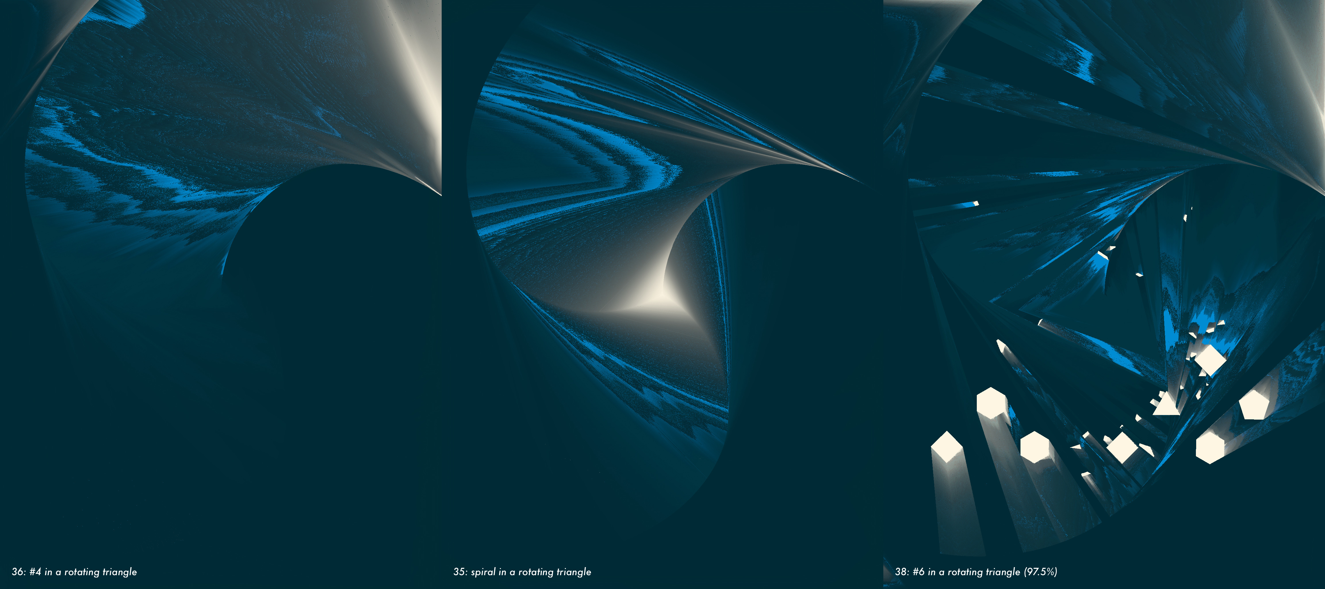
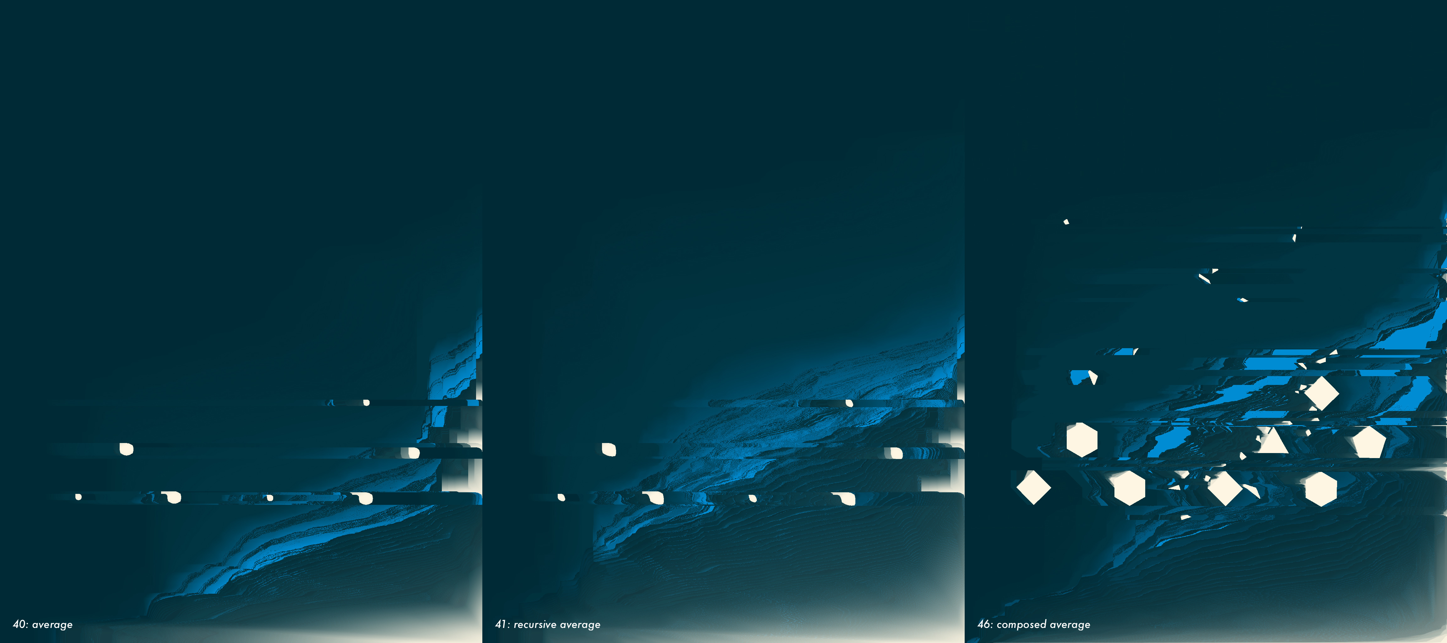
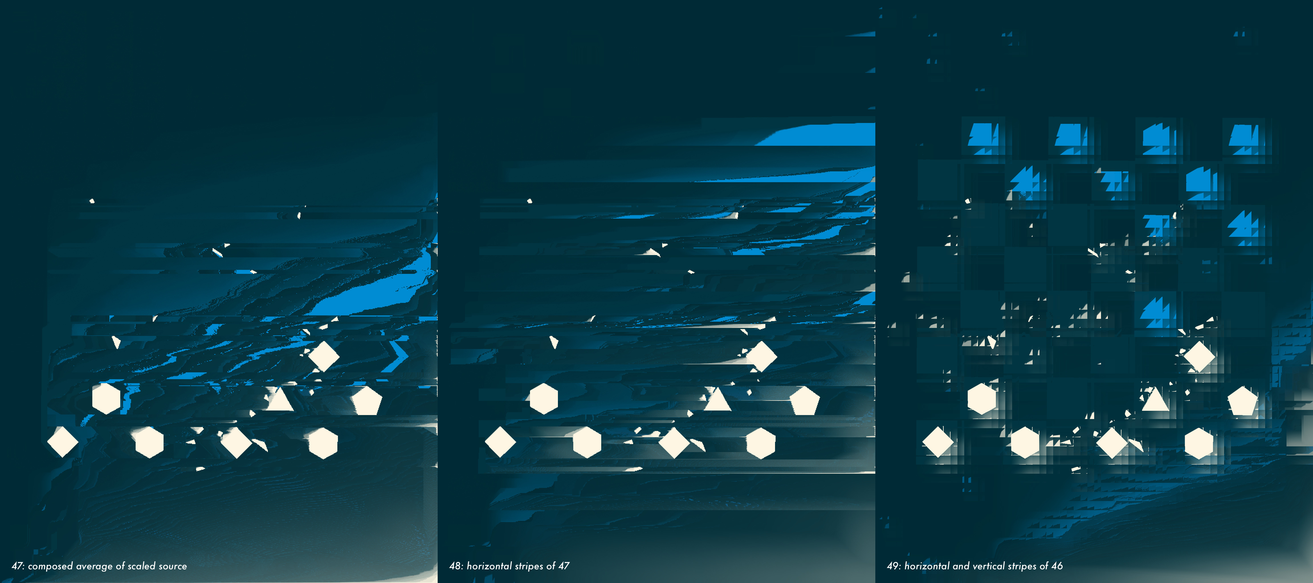
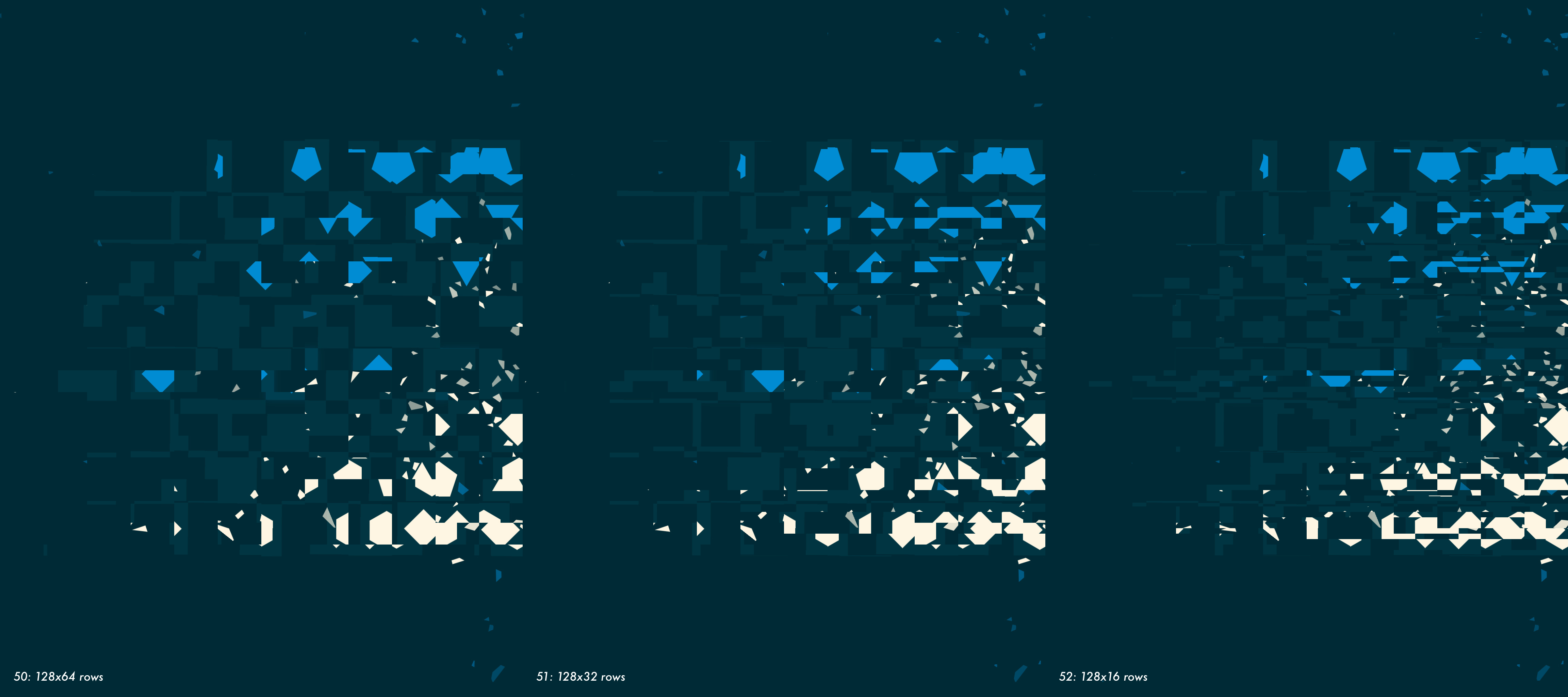
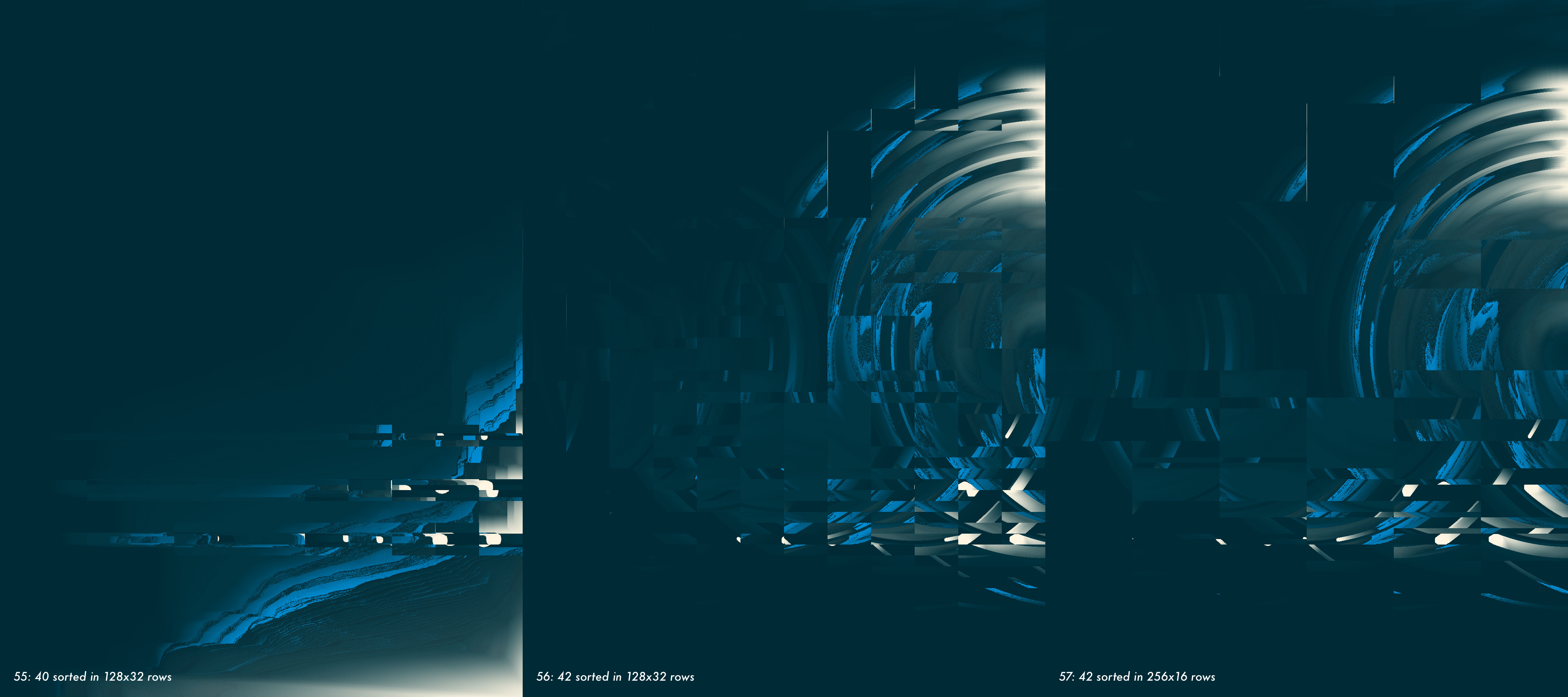
As you can see, pixel sorting is a very flexible technique. A creative tool in its own right rather than a simple post-processing effect.
With the plan to use this work on iOS, I implemented my experiments
in Swift, as UIImage extensions. Unfortunately, the effect is too
computationally expensive to be performed in real time. I have tried
showing few-seconds-old pixel-sorted screenshots in non-interactive
moments of the game: during the “end game” animation, under the menu, to
signal an invalid move, etc. It worked OK from the technical point of
view, but it didn’t feel right — flickering pixel-sorted images were
just too different from the game underneath. A short animation or a
real time effect would probably fit better, but they are unfeasible.
I ended up not using pixel sorting in the game at all. Nevertheless, the process of exploring this technique was very satisfying. I’m happy with the results.
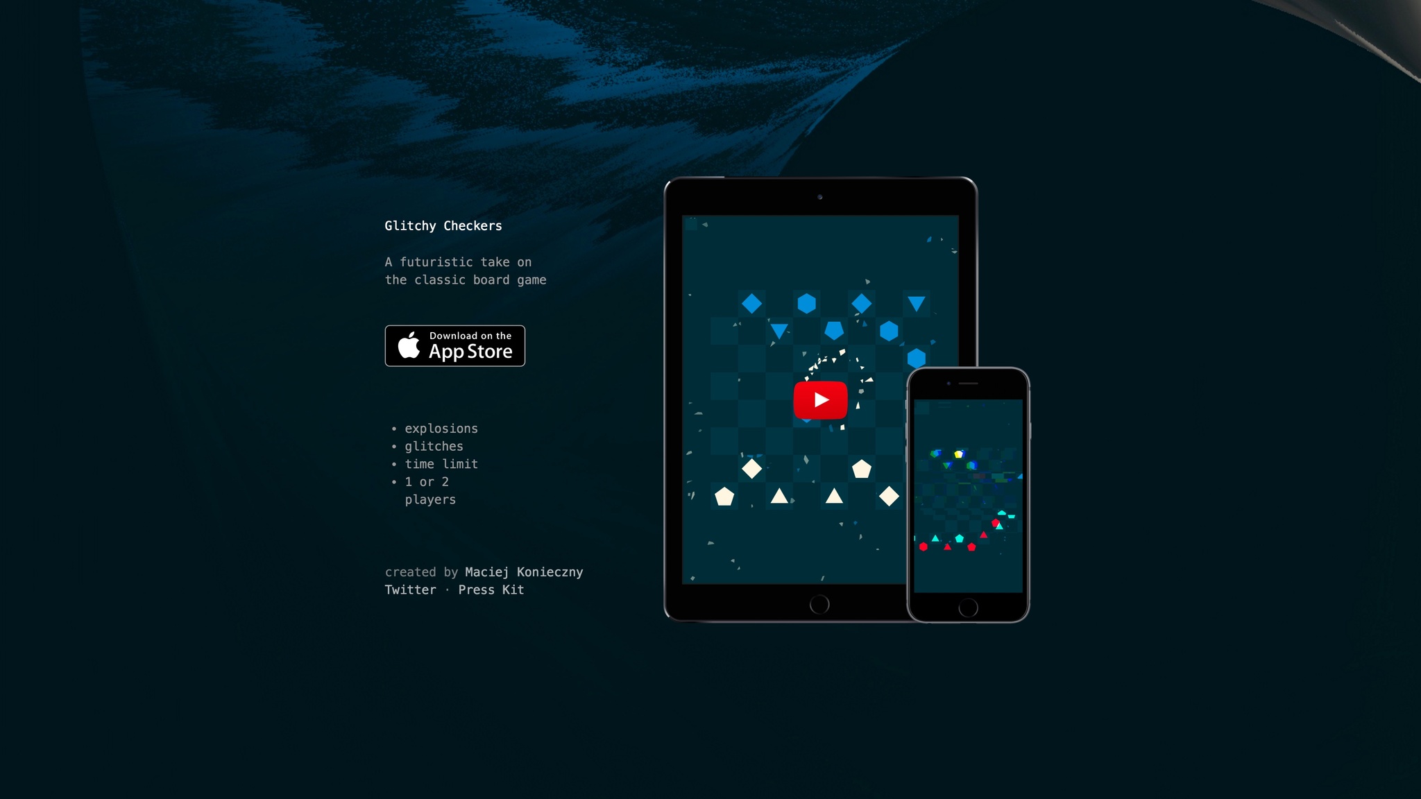
When it comes to Glitchy Checkers, I used one of the images as a website background:
PS I created all the graphics in Glitchy Checkers in code, and I did pixel sorting in code, so technically everything you’ve seen here, except for website screenshots, counts as procedural graphics aka “images from the keyboard”. 💥